Files
Contents
Introduction
A GNOME 3 style file browser tool.
Participants
Objectives
An easy tool that provides the ability to do basic file operations. Primary role is to cater to cases where the core content apps are not used or not applicable. The tool also has a role for more technical use cases, such as support or system administration.
- Browse local files (ie. /home/user/*) and removable devices
- Connect to and browse remote devices
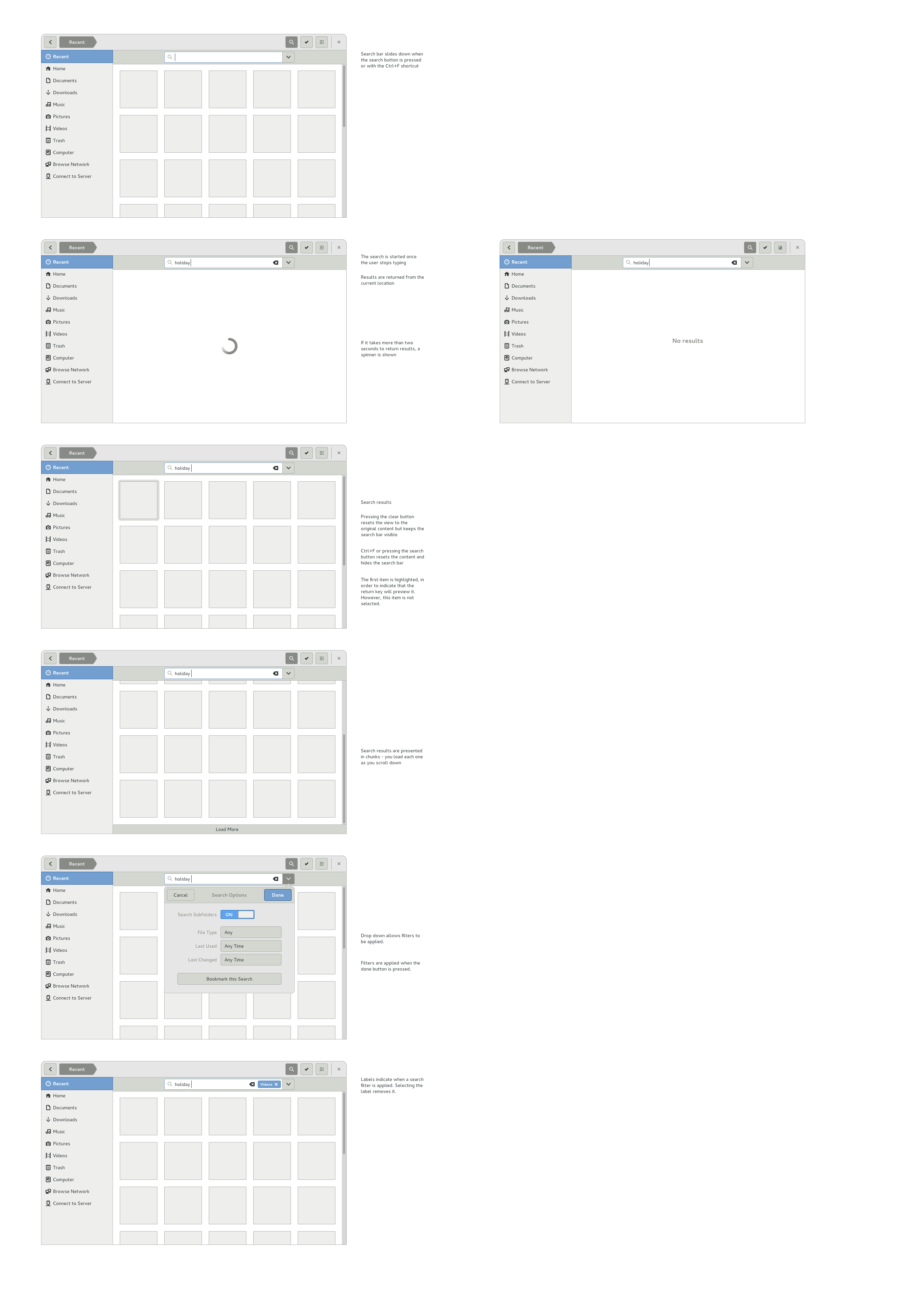
- Search for files
- Basic file operations - move, copy, delete
- Share/send files
- View the contents of trash and restore from trash
- Integrate with other GNOME 3 applications
- Allow importing into content apps - Music, Documents, Photos, etc
Constraints
Design should integrate into content selection
Relevant Art
OS X - Finder


Chrome OS

Windows 8


GNOME

Discussion
Nautilus's browsing UI has relied on a combination of:
- a breadcrumb widget
- back and forward buttons
- xdg folders
- bookmarking
Back and forward are somewhat connected to the xdg folders and bookmarking - the breadcrumb would provide enough back and forward functionality if there was no (or little) jumping between locations.
The Windows 8 and Chrome OS file browsers eschew bookmarking and solely focus on the file path as the navigation aid. This pattern is appropriate where the file browser is only used occasionally - repeated navigation to nested directories would be painful.
Update from April 2018
Over the years, there's been interest in adopting one or more of the following:
- Single click by default
- Selection mode (or a variant of it)
- Action bars
The motivation here was:
- To align Files with other applications and the application design conventions more generally (and simultaneously reduce the number of idiosyncratic conventions that users need to learn, like double-click)
- Be more touch friendly
- Make common actions more visible
- Provide better feedback about the active selection
Conclusions of some recent discussions about this:
- File managers are special. They're almost all the same in terms of their basic interactions (single-click to select, double-click to open, context menu for further actions) , which users are strongly habituated to.
- A number of file management conventions are connected to the single-click to select and double-click to open - rubber band selection, context menus, shift/ctrl+click modifiers.
- By far the most common action for a file is to open it, rather than cut/copy/trash/rename.
This probably means sticking to a fairly conventional model for Files, for the time being.
Tentative Design
Goals
- Consistency with file chooser
- Use patterns that can be shared with Content Selection
- Support maximized window without a titlebar
- Touch friendly
- A fast previewing tool
Nautilus Next
Plans for the next iteration of the Files app. More details can be found in Allan's blog post.


Nautilus Next Bugs
Nautilus Next bugs are marked with the nautilus-next whiteboard. A phased approach is needed for some aspects of the design, so these bugs reflect what needs tackling first.
Comments
Forward Backward Buttons
It is my opinion that the forward/backward button in Files (Nautilus) are unnecessary, it increase the cognitive load and make the interface look cluttered. The button don't fit well in the overall design of GNOME 3 which emphasis simplicity/cleanliness, we should try to get rid of GNOME 2 legacy stuff.
When I jump between folders (which I sometimes do a lot) I never use the forward/backward button but uses bookmarks and the breadcrumb. I think that it is enough to provide the user with two options of how to navigate in Files and focus on how to make these tools great (both in terms of design and functionality). I have done a design without the forward/backward button, feel free to take a look and make a comment. =)

Actually, that's how Thunar behaves by default.

Where is the Zeitgeist integration?! We would need a view for recently used files & folders instead of going to a deep folder every time by hand! What about event based file handling? Think new ways with Zeitgeist ![]()
--pothos
Well, I still think you should be able to chose between breadcrumbs or the location bar. I don't mind if breadcrumbs is the default, but there should be a choice. There are actually cases where breadcrumbs hinders usability:
- copy the current path
- paste a new path
- paste a new path and modify it before hitting enter (e.g. pasted src/main/java/org/foo/bar and prepend dev/projectx/ to it)
- switch to another path where just part of it changes (e.g. dev/projectx/src/main/java/org/foo/bar and dev/projectx/src/test/java/org/foo/bar)
put in different URI types (smb://, file://, etc), in my company we often send each other IM msgs or emails with paths to shared resources, sometimes it's a windows user to a linux user so we need to be able to modify the path after we paste it. Having to open a text editor for this is an overkill when it could be done directly in the location bar.
Even Microsoft sort of solved those issues with their breadcrumbs imlementation, it switches to a location bar when you need advanced usage :-). You can do that too, have breadcrumbs as default (with no back, forward and up buttons) but keep the location bar/breadcrumbs toggle button on the left. If you toggle to location bar the bar appears (and replaces breadcrumbs) and so do the back, forward and up buttons (back and up are not the same functions!), if you toggle back the breadcrumbs it switches back to it and removes the buttons/location bar.
--grossetti
For me the back and forward buttons are some times really helpful in my work. What could be helpful is to hide the forward button as done by Firefox. The forward button appears only if somebody actually had used the back button in advance.
--honga
Column View
Has anybody thought about implementing a column view? I'm sure some one did ![]() Is there a reason it is not implemented? I personally like this view very much, because it make navigation in deep structures very easy.
Is there a reason it is not implemented? I personally like this view very much, because it make navigation in deep structures very easy.

--honga