Nautilus Preferences Usability Review
The following is a usability review of the Nautilus Preferences dialog. It is being conducted on a Ubuntu 11.10 system. Any comment or discussion is welcome.
Review
For this review, I'm considering an item can be a folder or a file. The current dialog contains five tabs, as follows:
Views
Analysis:
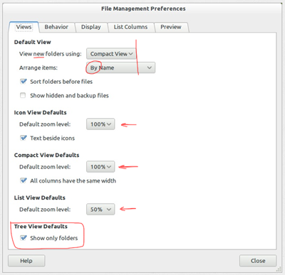
- The 'new' in 'View new folders using' might be confusing. It would be better if changes in view mode were reflected in the current window, as happens with changes in the other settings, favoring consistency and system status visibility.
- The 'Text beside icons' checkbox could be with the other icon caption settings, in the Display tab. The same goes for the 'All columns have the same width' checkbox, which could go in the List Columns tab.
- Tree View is not a view like Icon View, List View and Compact View. It is a sidebar view. This information should be clear.
Redesign:
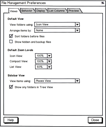
- The 'Text beside icons' and the 'All columns have the same width' checkboxes were moved to the Display Tab and the List Columns tab, respectively. This way, zoom controls could be grouped.
- A new heading 'Sidebar View' makes clear Tree View is a view mode for the sidebar. Also, it should be possible to change the sidebar view from the preferences dialog, as with the main view, for consistency.
Behavior
Analysis:
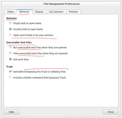
- 'Open each folder in its own window' might be confusing.
- Emptying the Trash is also an action of deleting files. Label could be more objective.
Redesign:
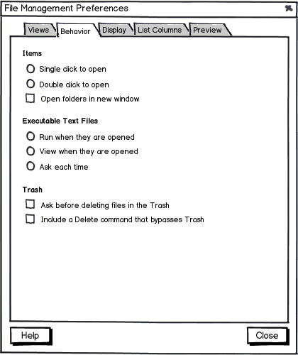
Display
Analysis:
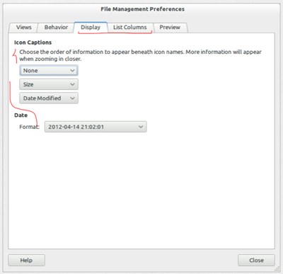
- Instructions about icon captions could be more objective.
- Unnecessary 'Date' header.
Redesign:
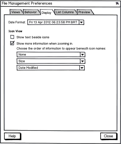
- Since I moved the 'Show text beside icons' checkbox to the Display tab, it made sense to change the header to 'Icon View'. This way, Icon View display settings are all grouped.
- User can choose either he/she wants more information to appear when zooming in or not. 'Choose the order of information to appear beneath icon names' and its drop-down lists are greyed out if 'Show more information when zooming in' is unchecked.
List Columns
Analysis:
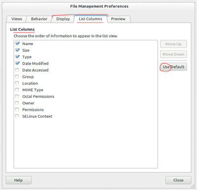
Redesign:
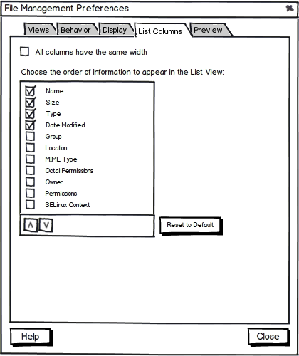
- Renamed 'Use Default' to 'Reset to Default' to make the effects more clearer to the user.
- The 'All columns have the same width' checkbox was grouped with the rest of the List Columns settings.
In a way, the List Columns tab works as a Display tab for List View. Should the contents of these tabs be merged? I experimented with it, but the resulting tab was a bit cluttered since there were a lot of controls (DisplayDesign2.png).
- Tooltip for 'Reset to Default' button: 'Replace the current List Columns settings with the default settings'.
Preview
Analysis:
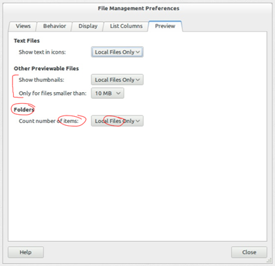
- Unnecessary headers.
- The complementary relation between 'Show thumbnails' and 'Only for files smaller than' could be clearer.
- 'Count number of items' and its header 'Folders make it confusing to understand the effects of this setting.
Redesign:
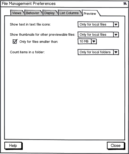
- If 'Show thumbnails for other previewable files' is set to 'Never', 'Only for files smaller than' should be greyed out.
- Renaming the possible options for 'Count items in a folder' makes the effects clearer .
