Documents
Contents
Introduction
It would be nice to have a simple and elegant replacement for using Files to show the Documents directory.
Designers
Jon McCann, Jakub Steiner
Objectives
- View recent local and online/cloud documents
- Search through documents
- Store a reading list / todo list - and provide reminders
- See new documents shared by friends
- View documents full screen
- Share documents (email, IM, ?)
- Upload documents
- Print documents
- Select favorites
- Allow opening full featured editor for non-trivial changes
Constraints
Relevant Art
WebOS

Firefox PDF Viewer

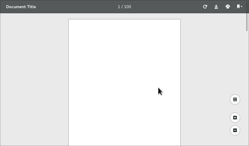
Chrome 52 PDF Viewer

Bar and zoom controls are shown on pointer movement only.
"Toolbar" buttons are (from left to right): rotate 90°, download, print, bookmark/table of contents menu (only displayed if there is a table of contents; stays open until dismissed).
No obvious way to add a bookmark.
OS X Preview

iCloud iWork
http://www.apple.com/uk/iwork-for-icloud/
Discussion
- How to indicate what is already uploaded
- How to differentiate between sources/providers
Tentative Design

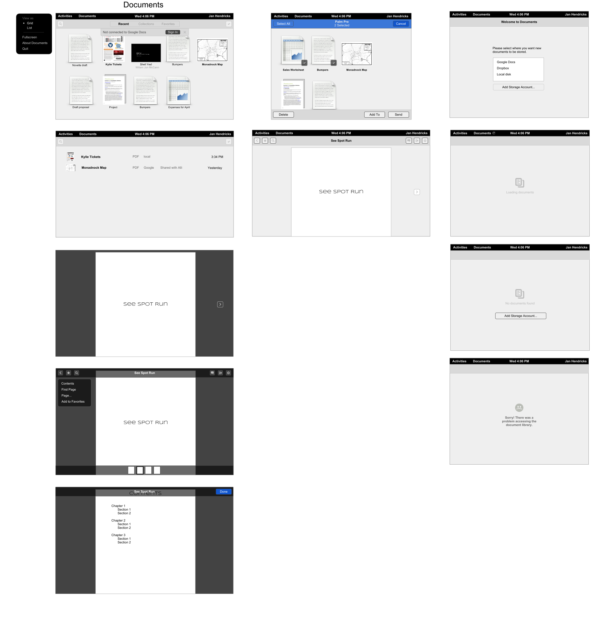
Grid and List View


Notifications
Application domain notifications are shown withing the app window, rather than using the system notifications.

Search
All the fullscreen-enabled apps use the same pattern for search. Search is hidden by default. It reveals if you scroll higher than the top of the main pane. It also slides out if the user uses the Ctrl+F or Ctrl+S shortcut, or starts typing without an explicit widget being focused. When dragging, the toolbar reveals the inputbox sliding down rather than stretching, and allows to go a few pixels past the fully exposed toolbar, retracting back on release, providing a bit of physcality and giving an indication that it will not slide out any more.

Apart from a text based search, clicking on the loupe icon reveals a megamenu allowing to limit teh scope of the results. Clicking on each item adds it to the search entry on the right hand side in the form of a tag. The logical operator for all these keywords is AND. Only one keyword per group can be selected (No OR operator).

Selections & Performing Actions


Preview & Fullscreen
FIXME
Comments
DHBahr: is there really a need for a «Selection Mode»? What about good old fashion single click for selecting (with Ctrl or Shift to add to current selection) and double click for opening the Document? Or may be hover for selection, single click for opening? Most likely allowing the user to determine which he/she prefers...
Ivan: Here are some arguments against double-click, however comfortable it is for many of us: http://www.codinghorror.com/blog/2004/10/double-click-must-die.html. And that's leaving aside the fact that double-click, and hover, don't work well with touch screens. Personally, playing around with iOS helped me appreciate the sort of selection mode that's illustrated here.
MatijsVanZuijlen: While there may be arguments against double click, having two different modes is not a good solution. On a desktop, there is ample space to provide both a selection target and open target for clicking all the time. Also, why would we want go back to software having modes?
